

If you have been around sports betting for any amount of time, you have likely interacted with some sort of place where you can compare odds across sportsbooks to shop for the best possible odds. Here is the Don Best odds screen, long considered the gold standard for professional bettors for getting up-to-date information:

You will see this layout pretty much everywhere. Here’s what the odds comparison site looks like at The Action Network, my former employer:
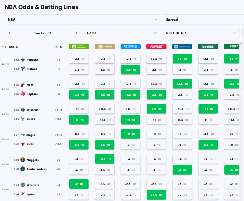
And here’s what it looks like at Vegas Insider, the first place that pops up when you Google “NBA Odds”:

This grid layout has been the standard design choice for every site serving bettors for the last 30+ years. And I think it’s a design choice that actively hinders bettors’ ability to make the smartest bets they can.
It’s a lot of redundant information on a single screen. Looking at a single game, I can get a pretty good sense of the market’s general view on how the game will go for the spread market. But I don’t need all of this space on a single page to get this consensus view, I could get it in a single aggregated cell in any one of these layouts. This has a non-trivial impact on actually using these odds screens: if I want to check moneyline or first half spreads/totals, I have to click on entirely separate tabs/screens. It may sound like not that big of a deal, but when lines are changing fast and you’re looking to exploit pricing mistakes, this design puts an undue burden on users trying to make this information actionable.
It doesn’t scale to modern betting markets, which have far more offerings. This design format becomes laughable when you try to apply it to player props. Here’s the prop tool for the Action Network, which takes the same design format and applies it to props:
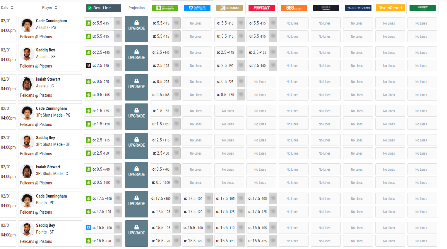
This is an insane cognitive load to put on users. I have to scroll for 2 minutes straight just to read every single prop for a single game, much less try to synthesize any of the information it presents (what’s the consensus view for each prop bet, what are the implied totals from the market prices, are there any pricing inefficiencies to exploit, etc.) Throw in the fact that these lines are constantly changing, and this format becomes quickly unusable.
It suppresses the concept of correlated outcomes. As we’ve discussed before, if you think one bet is different, you have to believe every bet is different. Certain design choices reinforce this concept more than others. If your odds display is predicated on knowing ahead of time exactly what you want to bet and just looking up the prices for that bet, you limit yourself to understanding how the bet you want to make correlates with other outcomes, and the potential pricing inefficiencies to exploit for those other outcomes.
These are the frustrations that drove us to build an odds screen that would actually address these problems. When we started, we knew we had to address these core requirements:
You should be able to see the consensus view for every market in a game without clicking through to multiple screens.
You should be able to spot price discrepancies to attack instantly.
You should be able to utilize the concept of correlated outcomes with the odds screen.
And that’s why our odds screen looks very different than everyone else’s.

The highlights:
You can get a snapshot of how the market thinks the game will go overall in 5 seconds, which is critical given how fast lines change.
You can instantly spot the color-coded markets that have price discrepancies you should be attacking. You can also see how many color-coded markets each game has just as quickly.

If you think one of the market’s views is wrong and want to bet on it, we’ll help you discover all the correlated outcomes if you’re correct, opening you up to attacking all markets and all their price discrepancies.

The overwhelming reaction we’ve gotten in our first week has been along the lines of “it takes a little time to get used to, but once I get the hang of it, it’s incredibly powerful.” This is exactly what we were going for. There’s no way around introducing a learning curve for a fundamental design change in the way you view and consume odds data, and we’ll be doing everything we can to reduce that learning curve. But it’s been incredibly gratifying to hear that for everyone that gets on the other side of it, it’s worth it.
We’re excited to launch a product that addresses the problems we saw with all the other odds screens, which comes from the most important principle of all with product design: build something you would use yourself. And we’ve had a lot of fun using it ourselves so far.
pph sites are the best interface, never had a bad PPH UX - have you ever seen one? For adept/experience bettors, the legal sites are trash and not desktop or mobile friendly.